ShopDreamUp AI ArtDreamUp
Deviation Actions


Suggested Deviants


Suggested Collections


You Might Like…


Featured in Groups


Description
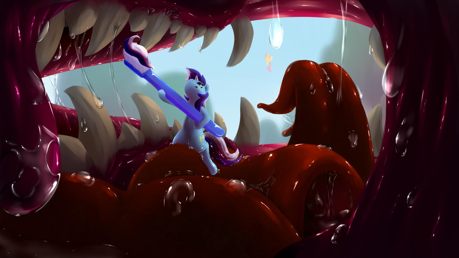
Colgate brush some teeth. Dragon teeth.
It is a mixed Idea from some from tumblr.
----------------------------------------------
MLP belongs to Hasbro
Art belongs to me
Please link back when you upload it somewhere else, thanks.
PS: the picture is about 16:9 rate, so you could use it as wallpaper too.
It is a mixed Idea from some from tumblr.
----------------------------------------------
MLP belongs to Hasbro
Art belongs to me
Please link back when you upload it somewhere else, thanks.
PS: the picture is about 16:9 rate, so you could use it as wallpaper too.
Image size
2000x1125px 1.22 MB
Comments219
Join the community to add your comment. Already a deviant? Log In
Great job on this piece. The hard work definitely shows. The perspective is very nice and clearly shows depth. I especially like the tiny Fluttershy in the background. Kudos on being able to draw saliva so well, but I think the glare should be much more subtle in the less illuminated areas both to add contrast to the shades of red hues in his mouth and to help shift the focus to colgate, as the less illuminated areas happen to be near the edges of the pictures, most likely intentionally. In some areas there's glare on the saliva where there isn't any light source to create glare, such as under the flap of tongue on the right, and glare should be removed in those areas. The teeth are very well drawn, but them seem so dry compared to the rest of the mouth, and the thick strands of saliva on some of them definitely support the idea that they should appear a bit more wet. Adding more glare would balance that out with the rest of the mouth, but I'd only add it to the teeth if some were taken out of the other areas of the mouth, especially the darker areas or areas where saliva is very concentrated.
As for Colgate her self, her pose is perfect and the underside of her head is drawn very well. I really like the foreshortening on her horn and the tongue sticking out. Her ear looks as if it's facing towards us, and I think that would be at too much of a forward angle compared to the direction she's facing. One major thing is her hair. While it's drawn very well from this angle, it should show some weight and gravity. Out of all ways to stick, straight up would need some serious hair gel to pull off. If you had the hairs on the top of her head falling behind her and the locks on her upper neck falling downwards I'd love this picture would be so much better. I know some people don't like to add gravity to their hair in the fears of it looking weird, but I'd love this so much more if the hair were drawn with gravity in mind.
Of course that isn't to say I don't love this picture. It immediately caught my eye as a thumbnail and didn't disappoint me upon closer inspection like so many pictures do. As far as originality, this is certainly that. There isn't a lot of Colgate fanart and this is one of the best that I've seen. I'll close this critique up how I opened it by saying once again great job on this piece.